

What Are the 5 Principles of Logo Design?
The logo is regarded as one of the most important elements of a brand identity. It appears to be the first thing people notice about a business, and it helps create an impressive visual impression in customers' minds. An effective logo is an easy-to-understand visual expression of a business's personality, values, and professionalism. Given its significance, the designers adhere to principles that make the logo effective, memorable, and impactful.
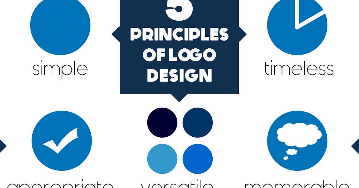
The five principles of logo design will help businesses create logos that are not only visually appealing but also accurately represent the brand. The principles will help designers develop logos that are easily understood, flexible, and able to stand the test of time.
The Significance of a Good Logo Design
A logo is not merely a graphic symbol. It is a graphical expression of a firm's identity and is significant in branding and marketing. A nice logo will help the customer associate with a brand quickly and build trust and professionalism.
As soon as people see a logo frequently, they begin to associate it with the company's products or services. This appreciation fosters brand loyalty and the business's overall reputation. Nevertheless, to do it, one should observe the main principles of logo design.
Simplicity
The first and most crucial rule of logo design is simplicity. A plain, straightforward logo is easy to identify, memorize, and replicate across other platforms. Complex designs may confuse viewers and prevent them from remembering the brand, due to excessive elements.
There are very simple logos that are among the most famous. Indicatively, the Nike swoosh or Apple logo has few design features, yet they are easily identified. This demonstrates that simplicity does not diminish creativity; on the contrary, it clarifies and makes it easier to remember.
Memorability
Memorability is the other important principle of logo design. The logo must be memorable so that when people see it, they will remember and identify the brand even after seeing it once or twice. To test the logos, designers tend to use numerous versions to ensure a balance between visual appeal and readability across all platforms. Memorability can be achieved through unusual forms, unusual typography, or clever visual ideas.
A logo that is easy to remember is easy to use and, at the same time, unique. Such memorability helps businesses cut across competitive markets. Companies that desire a strong, flexible brand image often engage professionals like logo design services to create logos that are effective both online and in print media.
Timelessness
Even a properly drawn logo would last several years. This code is referred to as timelessness. Design trends are quickly evolving, but a classic logo eschews fads and sticks to time-tested design principles.
Firms that overdepend on fashionable designs frequently redesign their logos. It may mislead the customers and devalue brand identity. On the contrary, a classic logo will be relevant in the long term and still represent the brand.
The Coca-Cola logo is a superb illustration of classic design. The company has introduced slight changes to the style of writing and printing; however, the overall typeface and style have remained the same for a century.
Versatility
The other major rule of logo design is versatility. Nowadays, logos should be presented in numerous formats and on numerous platforms in the digital world. Examples of places where a logo may be displayed include websites, social media profiles, product packaging, advertisements, and business cards.
For this reason, a logo needs to be adaptable so it remains readable and effective in other circumstances. A flexible logo works well in both large and small sizes and also looks good in black and white.
Relevance
Relevance is the last principle of logo design. A logo should capture the nature of the business and convey the right message to the target audience. The design should use appropriate colors, fonts, and symbols depending on the industry and the company's personality.
One of them is the children's brand, which can be painted in vivid, rich colors and amusing shapes to create a lively image. On the other hand, a financial institution may prefer a professional, minimalist design to help convey trust and stability.
The appropriate logo will make customers aware of the business and reinforce the bond between the brand and customers.
These principles go hand in hand
Five concepts for designing a logo are simplicity, memorability, timelessness, versatility, and relevance, all of which are interrelated. When both of these principles are considered, one will have a visual, easily recognizable logo that would work well across a variety of marketing media.
A logo based on these rules not only reinforces the brand identity but also supports long-term marketing plans. It turns out to be a strong mark that customers will relate to quality, dependability, and professionalism.
Conclusion
For a business aiming to develop a strong brand, it is important to understand the 5 principles of logo design. An effective logo should be easy to identify, memorable enough to stick in the mind of the customers, timeless enough to be applicable over a long period of time, versatile enough to ensure that it can be used on various platforms, and it should be relevant enough to portray the brand properly.
These principles are very helpful, and once observed, a logo is far more than a visual representation. It becomes the face of the brand and an effective tool that helps businesses reach their audience and be remembered in a competitive market.