

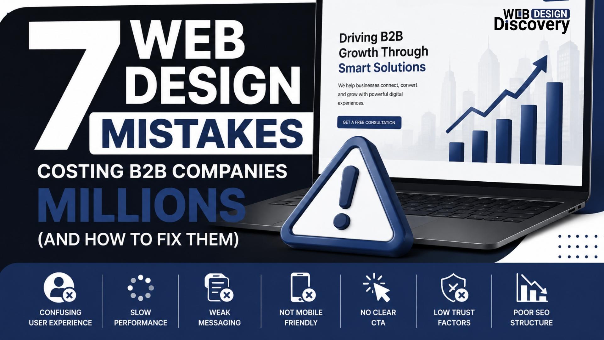
7 Web Design Mistakes Costing B2B Companies Millions (and How to Fix Them)
In B2B, your website is not just a “digital brochure.” It is your strongest sales asset, your first trust-building tool, and often the first place a decision-maker forms an opinion about your company.
And here’s the painful truth: most B2B websites don’t fail because they look ugly. They fail because they quietly leak money.
A small mistake in messaging, layout, page speed, or lead flow can cost a B2B company millions over time—through lost inbound leads, poor conversion rates, weak credibility, and longer sales cycles.
If you’re serious about improving ROI, working with a strong B2B web design agency is not about trends—it’s about fixing the exact problems that block growth.
Let’s break down the most expensive web design mistakes B2B companies make today, and what modern 2026-ready fixes actually look like.
Mistake #1: Designing for “Everyone” Instead of the Buyer Persona
One of the biggest B2B web design mistakes is trying to speak to too many audiences at once.
Many B2B companies create a homepage that says things like:
-
“We provide innovative solutions”
-
“We deliver excellence”
-
“Trusted by global clients”
It sounds professional, but it says nothing.
Why this costs millions
Because B2B buyers don’t have time. If your website doesn’t immediately confirm:
-
Who you help
-
What problem you solve
-
Why you’re credible
-
What they should do next
…they leave and visit your competitor.
How to fix it (2026 approach)
Modern b2b web design services start with buyer clarity, not visuals.
Your homepage should instantly answer:
-
“Is this made for my industry?”
-
“Do they understand my business model?”
-
“Can they solve my specific pain points?”
Fix tip: Build pages for each core audience (IT managers, procurement, founders, enterprise teams) instead of forcing one generic homepage to do everything.
Mistake #2: Prioritizing Looks Over Conversion Flow
A sleek design is useless if the website doesn’t guide visitors toward action.
A common issue in b2b web design and development is that websites look modern but lack structure. Visitors scroll but never know what to do next.
Why this costs millions
Because in B2B, most conversions don’t happen instantly. Your website must guide prospects into micro-actions like:
-
Downloading a case study
-
Booking a demo call
-
Viewing pricing structure
-
Submitting a project inquiry
Without those steps, your sales pipeline dries up slowly and silently.
How to fix it
Use conversion-focused page design:
-
Clear CTA buttons every 1–2 scroll sections
-
Sticky navigation with “Book a Call” option
-
Minimal distractions
-
Strong “next step” content blocks
Fix tip: Every page should have one primary goal. If you have 5 CTAs fighting each other, you will get zero.
Mistake #3: Weak Copywriting That Sounds Like Every Other B2B Company
In 2026, buyers don’t trust generic language anymore.
If your site copy looks like it was written by a corporate template, visitors assume your service is also generic.
Common examples of weak B2B copy
-
“We are committed to delivering quality solutions.”
-
“We are a leading provider in the market.”
-
“We focus on customer satisfaction.”
These lines are meaningless because they don’t prove anything.
Why this costs millions
B2B clients invest large budgets. They want expertise, proof, and clarity. If your copy feels vague, they assume you don’t have real experience.
How to fix it
Strong b2b technology web design uses “proof-based messaging.”
Instead of saying:
❌ “We provide scalable solutions.”
Say:
✅ “We help SaaS companies reduce onboarding drop-off by simplifying product education and UX flows.”
Fix tip: Replace claims with proof, frameworks, and specifics.
Mistake #4: Slow Website Performance (Especially on Mobile)
Speed is no longer a “technical issue.” It is a revenue issue.
In B2B, decision-makers often browse websites during travel, meetings, or between work sessions—usually on mobile.
If your website takes more than 3 seconds to load, you lose trust instantly.
Why this costs millions
A slow website leads to:
-
Higher bounce rates
-
Lower Google rankings
-
Reduced lead conversions
-
Poor credibility
Even if your service is premium, your website will feel outdated.
How to fix it (2026 tools & practices)
Modern fixes include:
-
Compressing next-gen images (WebP/AVIF)
-
Using lightweight animations instead of heavy video backgrounds
-
Removing unnecessary scripts and plugins
-
Using CDN delivery (Cloudflare-based setups are common)
-
Core Web Vitals optimization
Fix tip: Don’t just “test speed.” Fix what causes speed loss—usually large images, heavy sliders, and messy code.
A serious b2b web design firm will always design with performance first.
Mistake #5: No Trust-Building Elements (or They’re Hidden)
B2B buyers don’t buy quickly. They validate, compare, and research.
Yet many B2B websites hide trust-building proof in one small “About” page that no one reads.
Why this costs millions
Because trust is what shortens sales cycles.
If your website doesn’t show credibility instantly, prospects may still contact you—but the process becomes slower and harder to close.
What B2B trust elements should include
A strong b2b web design company typically includes:
-
Case studies (with real outcomes)
-
Client logos (only if real)
-
Industry certifications
-
Testimonials with names and job roles
-
Process breakdown (“How we work”)
-
Security and compliance mentions (especially in tech industries)
Fix tip: Put trust signals on your homepage, not buried in the footer.
Mistake #6: Confusing Navigation That Makes Visitors Work Too Hard
B2B websites often have messy menus like:
-
Solutions
-
Products
-
Services
-
Industries
-
Capabilities
-
Resources
And all of them overlap.
This creates decision fatigue.
Why this costs millions
Because confusion kills conversions. If a buyer cannot find:
-
What you offer
-
How it works
-
Pricing expectations
-
Proof of results
-
How to contact you
…they leave.
How to fix it
Use clean, buyer-friendly navigation:
-
Services (3–6 clear categories)
-
Industries (only if relevant)
-
Case Studies
-
About
-
Contact
Fix tip: Navigation should match how buyers search, not how internal teams describe services.
This is where professional b2b web design becomes a business advantage.
Mistake #7: Treating the Website Like a One-Time Project (Not a Growth System)
This is one of the most expensive mistakes in B2B.
Many companies redesign their website every 4–5 years, launch it, and then forget it.
But in 2026, your website is not a static asset. It’s a living conversion machine.
Why this costs millions
Because competitors are continuously improving:
-
landing pages
-
SEO structures
-
conversion funnels
-
content marketing hubs
-
AI search visibility
If you’re not evolving, you’re losing market share.
How to fix it
Modern b2b web design and development should include ongoing improvements like:
-
Monthly landing page testing
-
CTA conversion analysis
-
Heatmap tracking (Hotjar, Microsoft Clarity)
-
SEO content optimization
-
Updating case studies every quarter
-
AI-friendly structured content blocks
Fix tip: Treat your website like a sales funnel, not a design project.
What a High-Performing B2B Website Should Look Like in 2026
A modern B2B website is built for human trust and AI visibility at the same time.
Here’s what’s working best in 2026:
✅ Clear messaging above the fold
No generic taglines—straight value proposition.
✅ AI-friendly structured content
Google and AI assistants prefer clean headings, FAQs, bullet lists, and scannable sections.
✅ Conversion-first design
Every page has a goal: demo booking, lead form, or resource download.
✅ Fast performance + Core Web Vitals compliance
Speed and mobile optimization are now mandatory.
✅ Industry positioning
Your site must feel like it was designed for your niche, not for “any business.”
✅ Proof-driven trust building
Case studies, testimonials, results, process clarity.
Quick Checklist: Is Your B2B Website Losing You Leads?
Ask yourself honestly:
-
Does my homepage clearly explain what we do in 5 seconds?
-
Is it easy to book a call or request a quote?
-
Do we have real case studies with measurable outcomes?
-
Does the site load fast on mobile?
-
Does every page have a clear CTA?
-
Does the design feel trustworthy for enterprise buyers?
If you answered “no” to even two of these, your website is likely leaking revenue.
Conclusion
B2B website mistakes are expensive because they don’t fail loudly. They fail quietly.
They reduce inbound leads.
They weaken trust.
They make your sales team work harder.
They extend your sales cycle.
They lower your conversion rate month after month.
The good news is that these problems are fixable—and once fixed, a strong website becomes one of the highest ROI assets a B2B company can build.
After reviewing how modern B2B websites are structured today, one thing becomes clear: the best results come from working with a team that understands strategy, conversion behavior, and real B2B decision-making psychology—not just design.
That’s why many companies exploring professional website improvements often end up shortlisting specialists like Webdesign Discovery as a reliable option when searching for a practical, performance-focused B2B web design agency.